All projects

SaaS Apps
Dashboards
Redesigns
Project
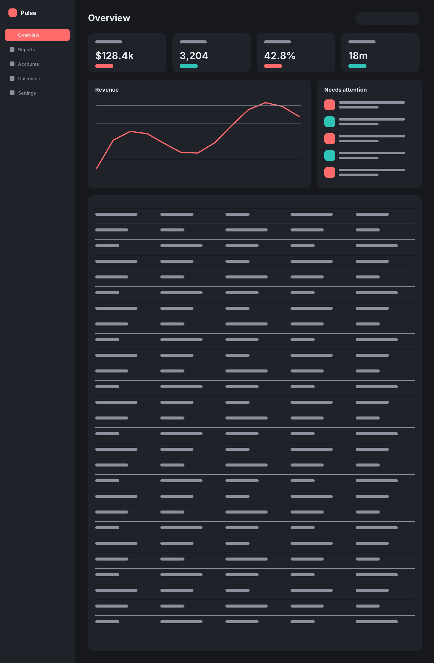
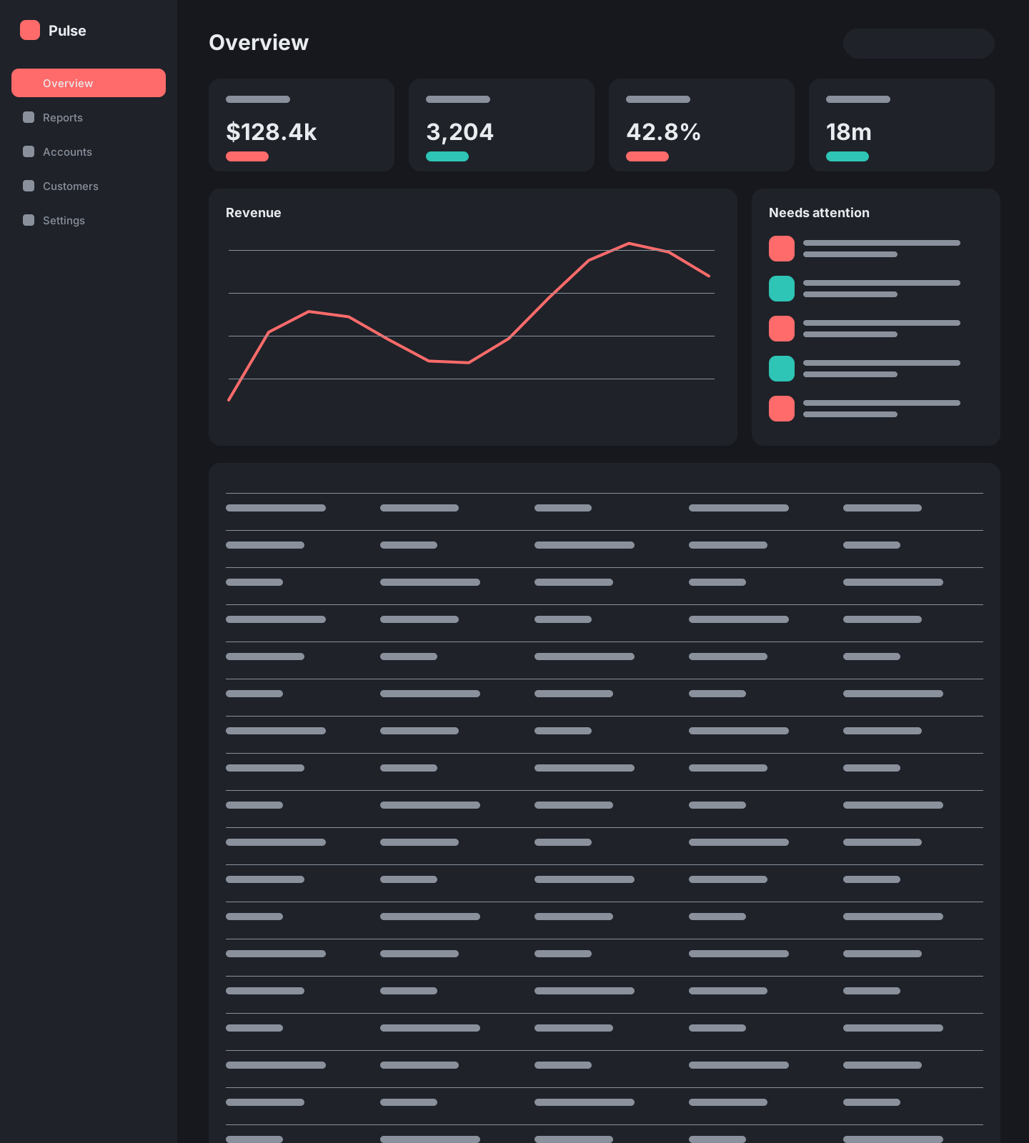
Analytics SaaS – Dashboard Redesign
Client
 Pulse
Pulse
Outcome
Fewer 'where is that?' support tickets
The problem
Power users loved the depth, new users drowned in it. Navigation had grown to 40 items across three menus.
The result
A rebuilt information architecture, saved views and an empty-state system that teaches the product as you use it.
Colour
Click a swatch to copy its hex.
Typography
- Headings & UIDM Sans
Aa
Weekly active users
- DataDM Mono
Aa
42.8% ▲ 3.1
Components
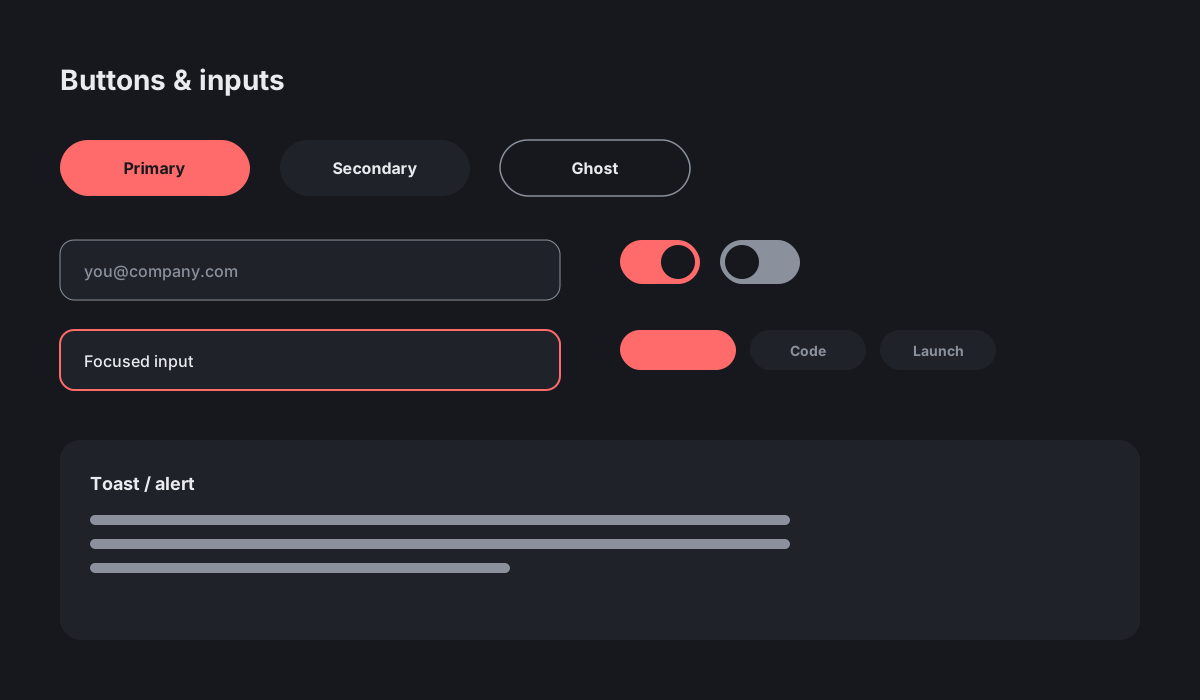
Buttons & inputs 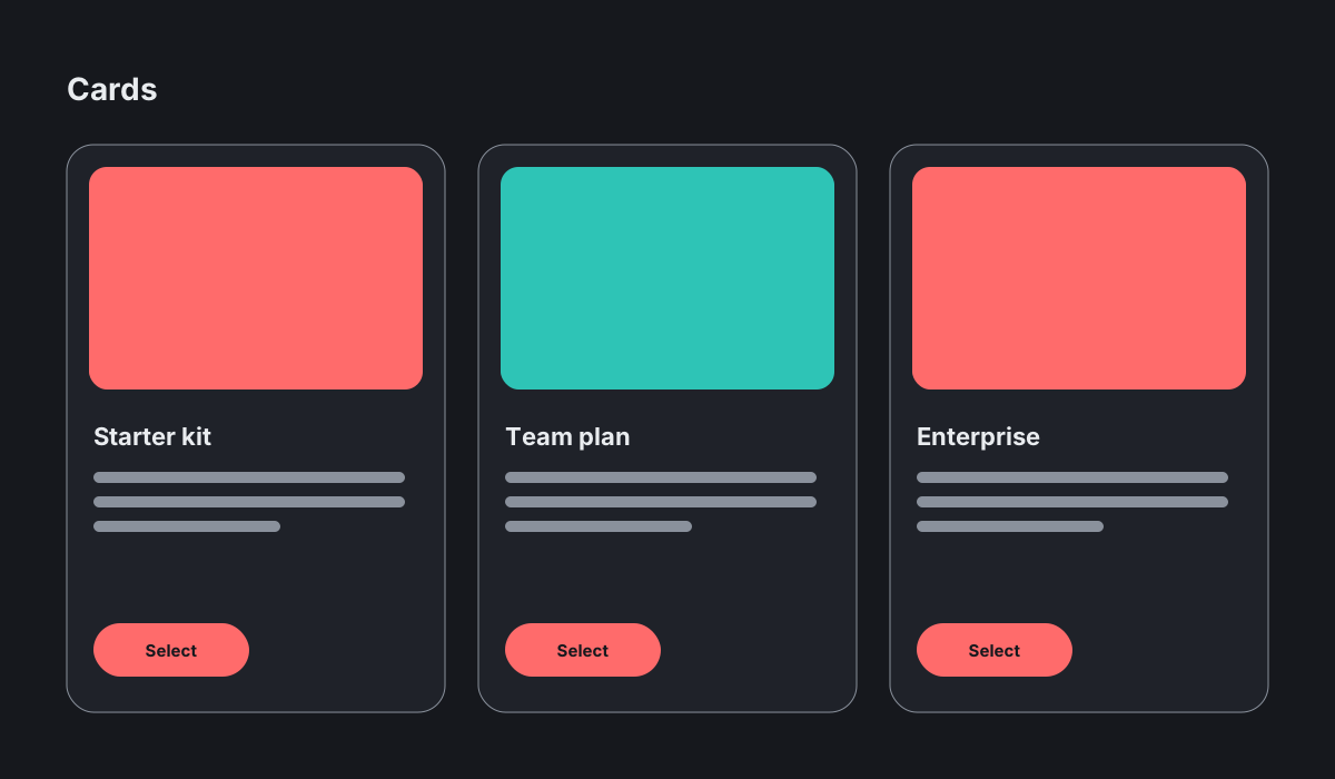
Cards
Next project
Project Echo
AI Voice SaaS – Website Redesign